As suggested to me during the last class meeting,I have been conducting in-person user testing of the WayFinder application over the past two weeks.
I conducted these tests using individuals from what I define as my two major target groups. “Corporate” Employees and “Creative” Employees. I defined corporate employees as individuals with more menial tasks such as sending emails, organizing spreadsheets/documents, etc. I defined “Creative” Employees as individuals with responsibilities like creating graphics/assets.
I conducted testing with two people in each group, I found that the creative employees appreciated the schedulers ability to break down complicated tasks, where as corporate employees appreciated the (very early stages of) focus mode/dynamic notification pusher. One person noted that they liked “How it stops everything with one button and turns everything back on with one button.”
However a consistent point of criticism I received from the users concerned the UI as many felt it was both cumbersome and visually “messy.” So the bulk of my time over these past few weeks has been spent implementing proper UI elements into the application.
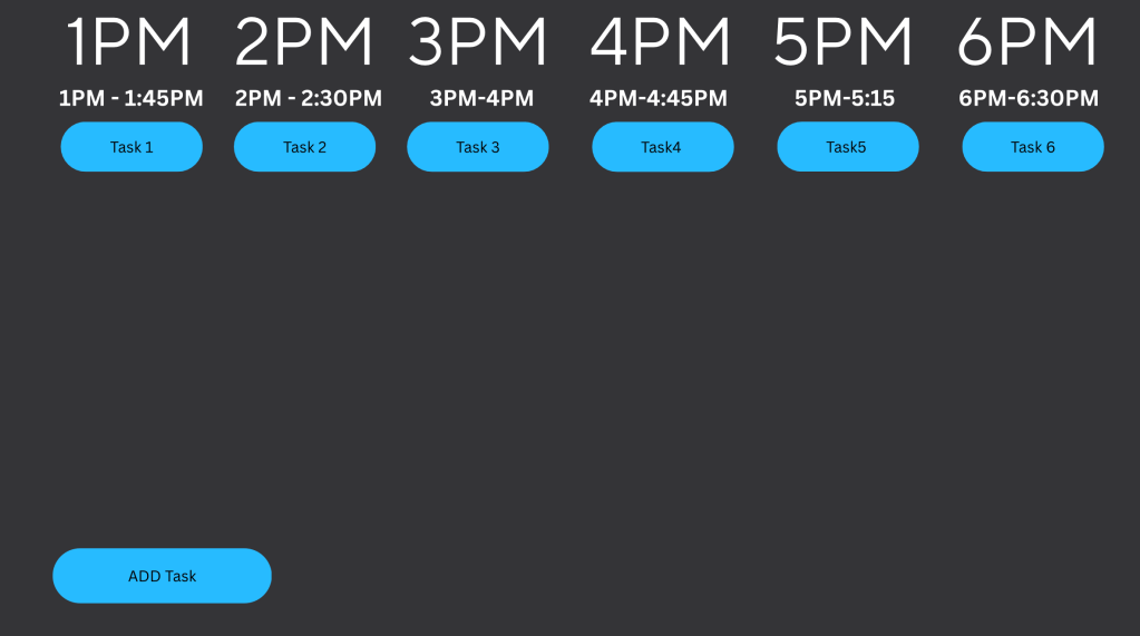
Pictured here is the new calendar. I wanted to maintain a minimalist aesthetic for the application so I opted to use 4 colors across the application, Blue for objects the user can interact with, white for UI elements, black for text, and grey for the background.
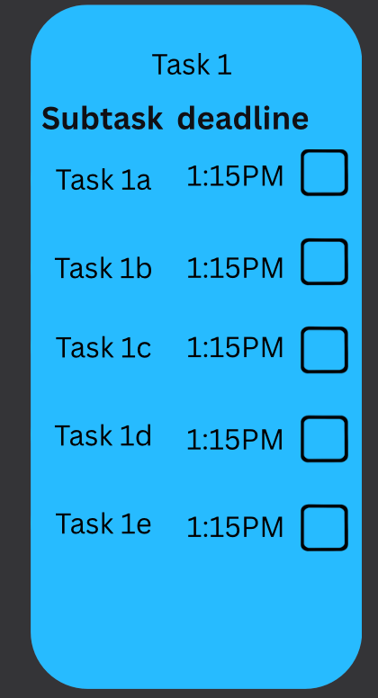
When a user clicks on one of their tasks, the task bar will morph into a drop menu where the users see each of their subtasks, deadlines to complete them, and a check box to mark when they have completed them.

Leave a comment